Top Way Journal
Stories, updates, and standards that shape our work—offering a closer look at the projects we deliver, the values we uphold, and the policies that guide our commitment to excellence, transparency, and sustainable impact across Iraq and the region.
Jul 22, 2025
Top Way Unveils New Logo and Brand Identity to Reflect Strategic Growth

As part of our continued evolution and strategic direction, Top Way is pleased to formally announce the launch of our new corporate logo and refreshed brand identity. This update reflects our commitment to progress, precision, and the high standards we uphold across all sectors in which we operate.
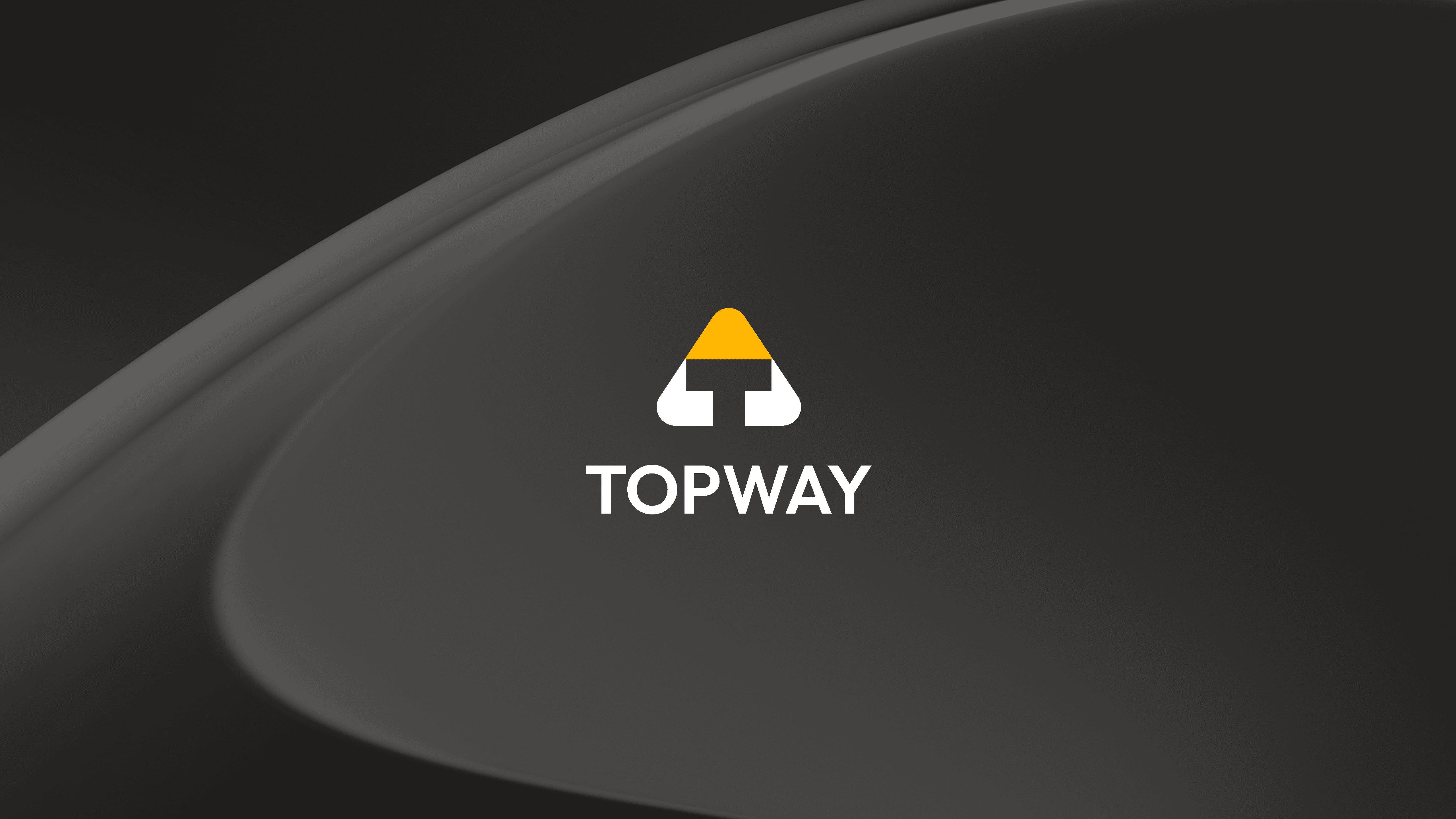
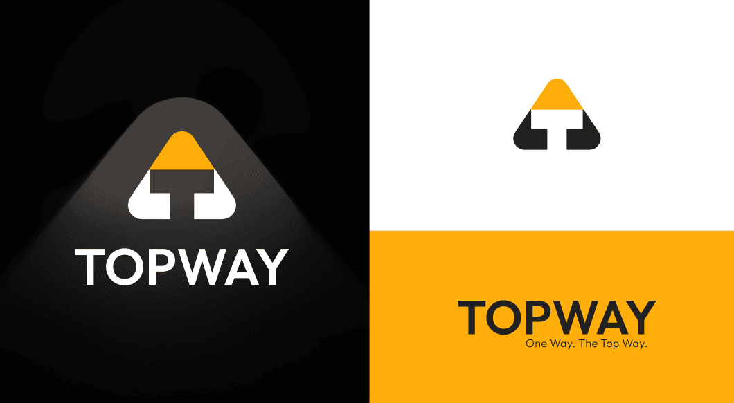
This concept takes a more geometric route to clarity, carving a bold path upward with a logo that feels stable, sharp, and unmistakably intentional. At the heart of the mark is a triangle, an age-old symbol of growth, elevation, and direction, cleverly paired with a stylized T at the base to ground the brand in strength and identity. The yellow peak signals aspiration and energy, while the black and white contrast creates a grounded and confident presence that reflects Top Way’s operational solidity. The triangle not only represents the idea of rising to the top but also evokes construction, progress, and directional momentum, all of which are deeply embedded in the brand’s role as a regional enabler. The typography is clean and assertive, perfectly echoing the logo’s clarity and discipline. This is a concept that knows where it is going and makes sure everyone else does too, visually reinforcing that Top Way is not just a service provider but a platform for upward movement and transformation.
Aligning Brand With Vision
Since our establishment, Top Way has built a reputation for reliability, operational excellence, and integrity in service delivery. As our operations have expanded and diversified, the need to realign our visual identity with our current position and future ambitions became evident.
Our updated brand is designed to visually communicate the strength, clarity, and professionalism that define our work, while also reinforcing our future-focused mindset.
Key Enhancements
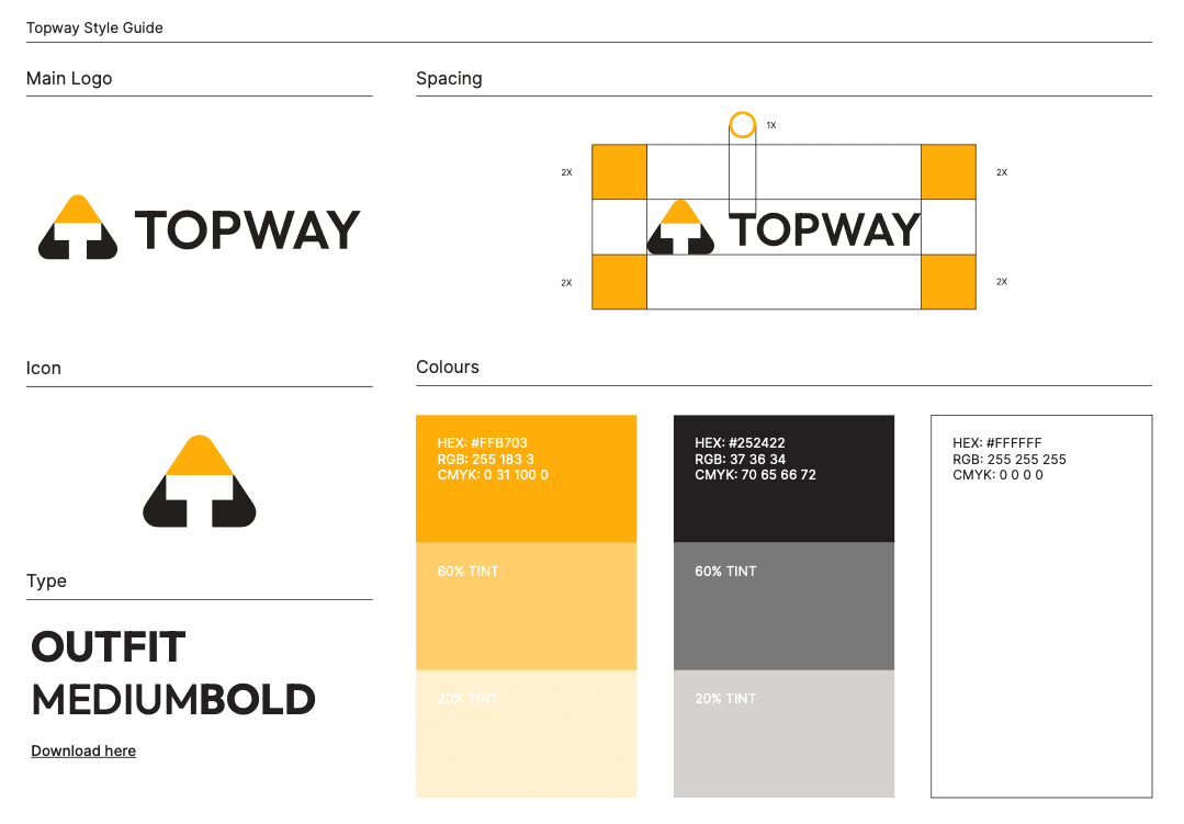
✔ New Logo Design
The refreshed logo features a modern, minimalistic design that communicates stability, forward motion, and trust. It encapsulates the Top Way ethos: disciplined execution, ethical operations, and long-term vision.
✔ Updated Corporate Color Palette
The revised color scheme reflects confidence and clarity, helping to create a unified and professional visual experience across all platforms and communications.
✔ Streamlined Brand System
The new branding is optimized for consistency across all formats—from digital platforms and printed material to uniforms, fleet branding, and facility signage. This ensures a cohesive and professional presence in all environments.
Why It Matters
This rebrand is more than a visual update—it is a strategic move that supports our long-term goals. It represents our continued commitment to operational excellence and reinforces our role as a trusted and forward-thinking partner to clients, stakeholders, and communities.
Our values remain unchanged: integrity, service, quality, and accountability. This brand evolution simply provides a clearer, stronger expression of who we are—and where we’re headed.
Looking Forward
As we implement the new identity across all communications and touchpoints, we remain focused on delivering best-in-class service and upholding the standards that have made Top Way a recognized name in the region.
We appreciate your continued trust and support as we take this important step in our journey.
– Top Way Management